Housewares / Design Language
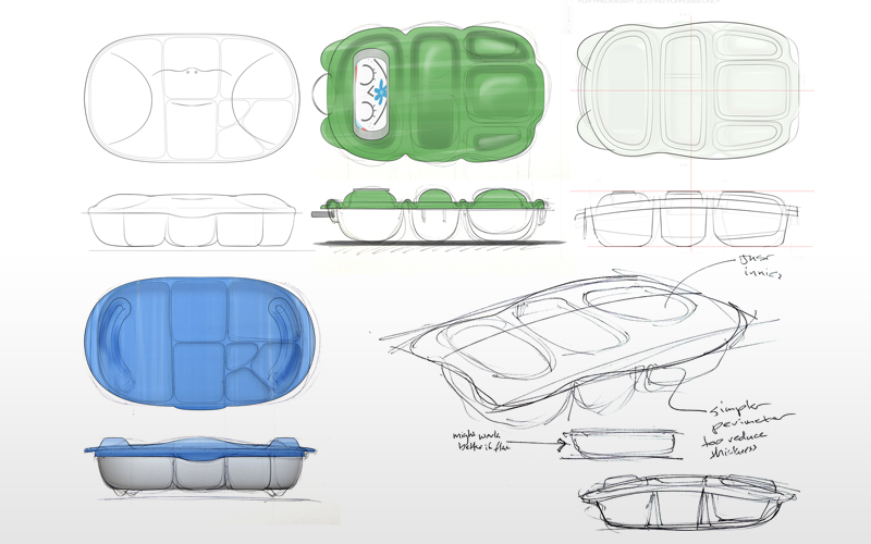
Vision Comes First
This example of client work illustrates how we successfully injected a brand’s vision into their products. This client knew up front that joy, playfulness, and whimsy were qualities that reflected their point of view as a brand. These qualities were also relevant to their target market. This is exactly the kind of input that is needed to deliver a distinctive design language.
Design Language
By iterating around the qualities they expressed we were able find a direction that celebrates the innovative idea of a multi-compartment food container and captures the spirit of the brand.
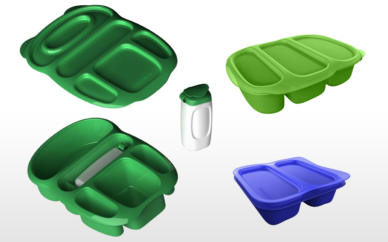
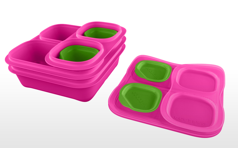
The end result is a playful aesthetic that brings joy and whimsy to lunchtime while the separate compartments bring peace of mind to busy parents who are keen on keeping plastic baggies out of the waste stream.